
The Power of Whitespace: How Spacing Shapes Font Aesthetics
The Power of Whitespace: How Spacing Shapes Font Aesthetics
When we talk about beautiful typography, most people focus on the shapes of the letters. However, what often goes unnoticed—but is equally crucial—is the whitespace and spacing between and around those letters. Whitespace (also called negative space) and spacing are silent elements that define the elegance, readability, and overall aesthetic of a font.
What is Whitespace in Typography?

Whitespace refers to the empty areas around characters, words, and paragraphs. It doesn’t just exist between the letters but also around the font’s form—such as the counters in letters like o, e, and a. This “breathing room” allows the text to feel open, balanced, and pleasing to the eye.
The Role of Spacing in Font Aesthetics
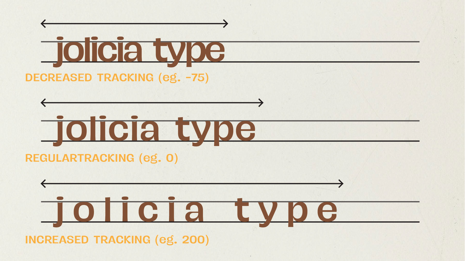
Spacing includes kerning (space between two characters), tracking (overall spacing across letters), and leading (vertical spacing between lines). Proper spacing ensures that fonts are both legible and visually appealing. For example:
- Tight spacing can give a modern, bold look but may harm readability if overused.
- Generous spacing can make fonts feel luxurious, minimalistic, or elegant.
Typography giants like Helvetica or Futura are celebrated not just for their letterforms but also for the perfect balance of space around each character.
Why Does Whitespace Matter?

- Enhances Readability: Crowded text feels heavy and difficult to scan, while well-spaced letters guide the reader smoothly.
- Creates Visual Hierarchy: Whitespace helps draw attention to important text, making designs feel structured.
- Improves Aesthetic Appeal: Fonts with thoughtfully considered spacing look polished and professional.
How to Master Whitespace and Spacing

- Adjust Kerning and Tracking: Ensure individual letters don’t feel too tight or too loose.
- Use Negative Space Creatively: Let whitespace guide the eye rather than fill every corner with text.
- Experiment with Line Height: Proper leading adds clarity and elegance, especially in body text.
- Pair Fonts Wisely: A well-spaced font can complement more compact typefaces, balancing the overall design.
Conclusion
Whitespace and spacing are as important as the letterforms themselves in typography. Designers who master these subtle elements can transform ordinary text into visually stunning, highly readable works of art.